How to Read Your Klaviyo Dashboard Without Getting Distracted by Vanity Metrics

Most founders and operators who log into Klaviyo every week are looking at the wrong numbers. Not because they don't care about performance, but because the dashboard surfaces engagement metrics first, and engagement metrics are easy to feel good about.
A 42% open rate looks like a win. A 3.8% click rate looks like progress. Neither one tells you whether your email programme is actually making money. And at $1M to $15M in revenue, where email should be driving 25-35% of total sales, "looking like a win" is not the same as being one.
This post is about the Klaviyo metrics that track revenue, the ones that don't, and how to build a reading habit that tells you what's actually happening in your programme.
Why open rates are no longer the metric you think they are
Open rate used to be the clearest signal of list health and subject line performance. Since Apple introduced Mail Privacy Protection (MPP) in 2021, it has become unreliable as a standalone metric for most DTC brands.
MPP automatically pre-loads email content for Apple Mail users, registering an "open" regardless of whether the recipient actually read anything. Depending on your audience's device mix, this can inflate reported open rates by 15-20 percentage points or more, according to benchmark data from Prospeo's 2026 analysis.
What this means in practice:
- A 45% open rate in 2024 does not mean 45% of your list read that email
- Subject line A/B tests based on open rate alone are partially measuring MPP pre-loads, not human decisions
- If your open rate climbed sharply between 2021 and 2023 without a corresponding lift in clicks or revenue, MPP inflation explains a significant portion of it
Open rate is still useful as a relative benchmark within your own account. Compare this month's campaigns to last month's, not to industry averages. And always check whether click rate moved in the same direction. If open rate went up but click rate stayed flat, the "improvement" is noise.
The metrics that actually tell you if email is working
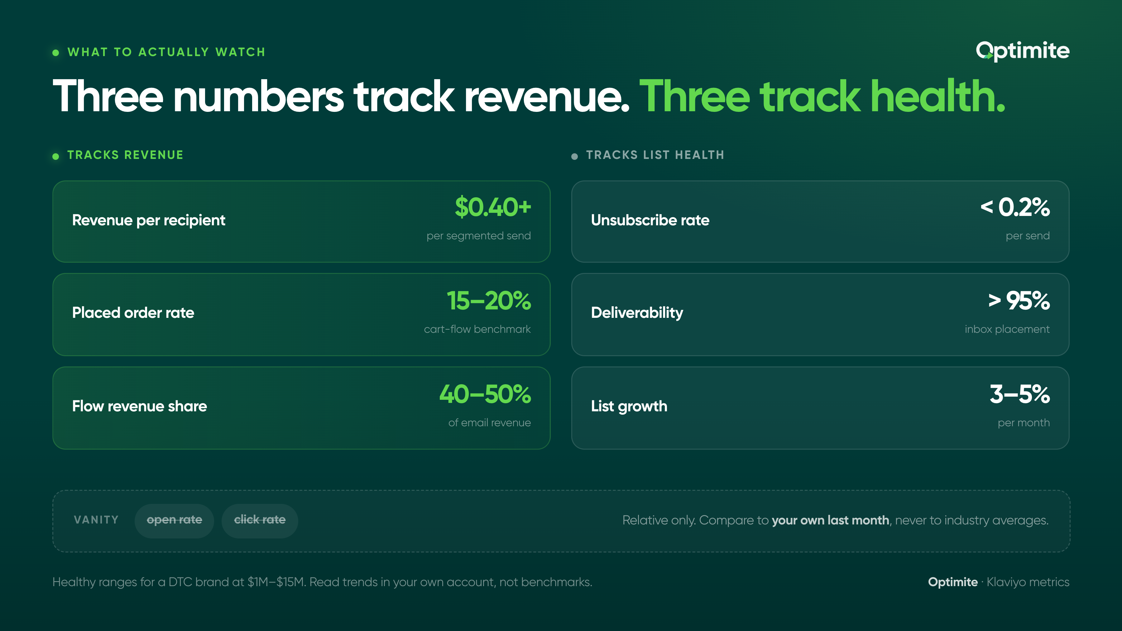
There are three Klaviyo metrics that correlate directly with business outcomes. Everything else is either a diagnostic tool or a deliverability health check.
Revenue per recipient (RPR)
RPR is the single most useful metric in your Klaviyo account. It divides total attributed revenue by total recipients for any given flow or campaign, giving you a number that accounts for both conversion rate and average order value at once.
According to Klaviyo's 2026 benchmark data across 183,000+ brands, the average RPR for email campaigns sits at $0.11. The average for automated flows is nearly 18x higher. That gap explains why brands with a strong flow architecture generate 35-40% of email revenue from flows that represent just 5% of total send volume.
Klaviyo shows RPR at the campaign and flow level. It should be the first number you look at when reviewing performance, not the last.
Placed order rate
Placed order rate tells you what percentage of recipients actually bought something. A campaign with a 40% open rate and a 0.05% placed order rate has an engagement problem, not a deliverability problem. The list opened it and then did nothing.
Benchmarks from Klaviyo's Q4 2024 data show abandoned cart flows averaging a 15-20% conversion rate, compared to 0.08% for standard campaigns across all industries. If your post-purchase or welcome flow placed order rate is well below benchmark, that is a segmentation or content problem, not a volume problem.
Flow revenue share
At the account level, check what percentage of total email revenue comes from flows versus campaigns. Across the brands Optimite works with, a well-built retention programme runs at 40-50% of email revenue from flows. If yours is below 30%, the flows are underbuilt. If it is above 60%, the campaign programme likely needs attention.
This single ratio tells you more about the health of your email architecture than any individual campaign metric.
The three metrics worth monitoring for list health
Engagement and revenue metrics tell you how the programme is performing. These three tell you whether the infrastructure underneath it is sound.
Unsubscribe rate
A healthy unsubscribe rate for ecommerce sits below 0.2% per send. Above 0.3% is a signal worth investigating: you are either sending too frequently, targeting too broadly, or sending content that does not match subscriber expectations. In Klaviyo, filter by segment to find out whether unsubscribes are concentrated in a specific cohort. Winback sequences and re-engagement campaigns often have higher unsubscribe rates by design. An elevated rate on a standard campaign to your engaged list is not.
Deliverability rate
Klaviyo reports deliverability as the percentage of emails that successfully reached an inbox. Below 95% is a warning sign. Below 90% means there is an active deliverability problem that will suppress performance across every flow and campaign until it is resolved. Deliverability issues compound quickly because poor inbox placement reduces engagement, which further damages sender reputation.
List growth rate
Month-over-month list growth tells you whether your acquisition infrastructure is keeping pace with natural churn. If your list is shrinking or flat, you will eventually run out of engaged subscribers to send to, no matter how well your flows perform. A healthy DTC brand at $1M-$15M should be growing its email list by 3-5% per month, with pop-up opt-in rates above 5% as a baseline target.
How to read the flows dashboard specifically
The flows dashboard is where most of the insight lives for a brand with a built-out retention programme, and it is also where the most misreading happens.
A few things to watch for when reviewing flow performance in Klaviyo:
- Do not compare flow open rates to campaign open rates. Flows go to people who just took a specific action (purchased, browsed, abandoned). Of course they open more. The relevant comparison is flow-to-flow, or your flow versus its own historical performance.
- Check the email-level data within each flow, not just the flow summary. A welcome series with a 48% open rate on email 1 and an 18% open rate on email 3 has a drop-off problem at email 2. The summary rate masks it.
- Revenue attributed to a flow is a 5-day attribution window by default in Klaviyo. If someone receives email 3 of your post-purchase flow and then buys something three days later, that revenue is attributed to email 3. This is worth knowing when you are comparing individual emails within a sequence — the later emails in a flow often look weaker because the attribution window overlaps less with the customer's natural buying behaviour.
What a useful weekly dashboard review looks like
Most brands either over-report (pulling every metric for every send) or under-report (checking one number and calling it done). A useful weekly review takes around 20 minutes and covers five things.
- Account-level email revenue this week vs. last week vs. same week last year. Context first. If revenue is down, is it a campaign issue or a flow issue?
- RPR for any campaigns sent this week. Above $0.40 for a segmented send is solid. Below $0.15 suggests the offer, the audience, or the content needs work.
- Flow revenue share. Is flows as a percentage of total email revenue moving up or down over the trailing 30 days?
- Deliverability rate. Any movement below 96% warrants a closer look at suppression lists and bounce handling.
- Unsubscribe rate on the most recent campaign. Particularly for brands sending 3+ times per week, this is the early warning signal for list fatigue.
That is the dashboard. Five data points, 20 minutes, and you have a clear enough picture to know whether anything needs attention this week.
The comparison that reveals the most
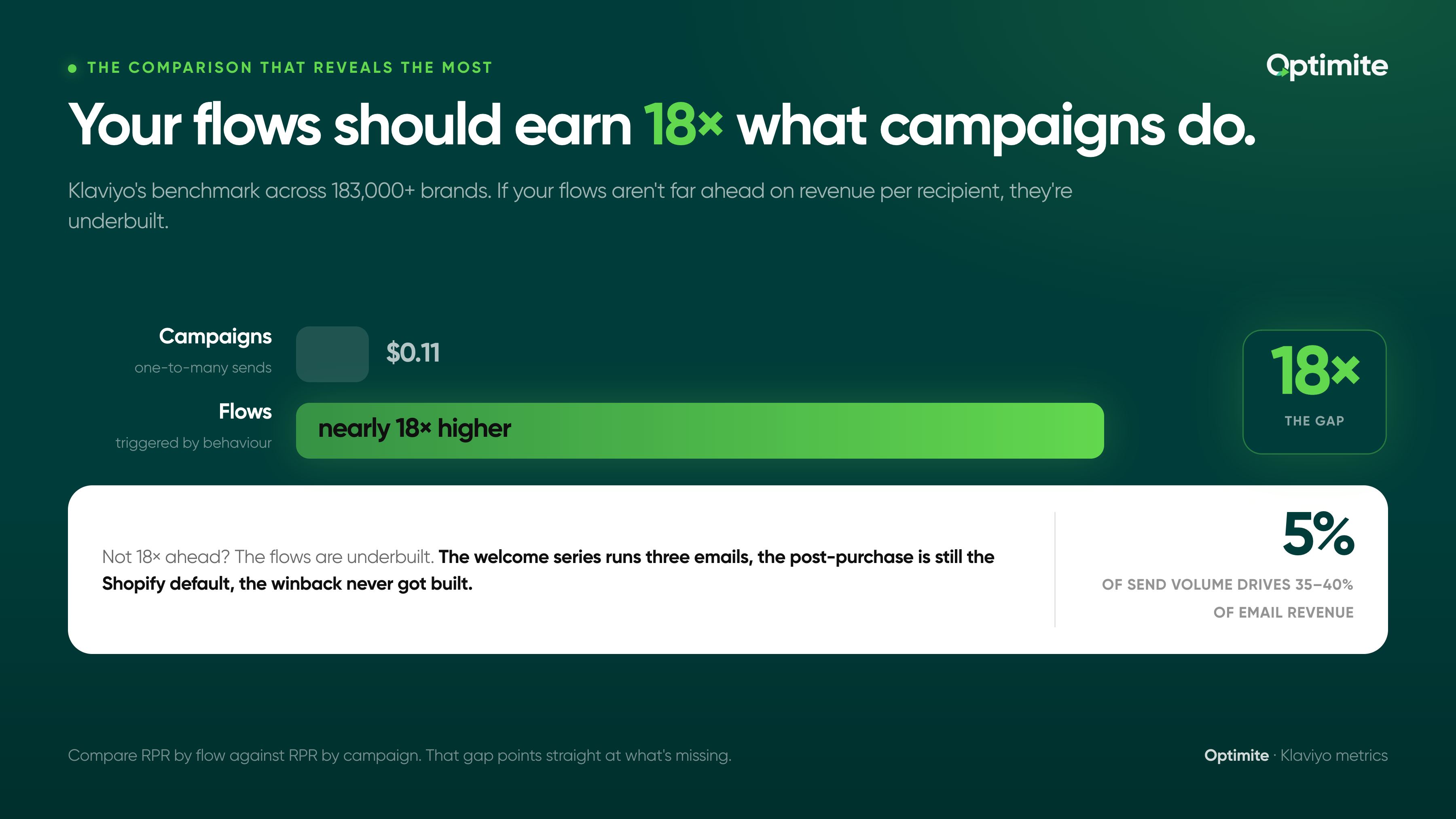
If you want a single diagnostic that tells you whether your Klaviyo programme is built correctly, compare the RPR of your flows against the RPR of your campaigns. Klaviyo's benchmark data shows flows generating nearly 18x the revenue per recipient of campaigns. If your flows are not meaningfully outperforming your campaigns on RPR, one of two things is true: your flows are underbuilt, or your campaigns are unusually strong.
In almost every audit we run across fashion, wellness, beauty, and food and beverage brands, the gap is because the flows are underbuilt. The welcome series runs three emails. The post-purchase flow is still the Shopify default. The winback never got built. Each missing or weak flow represents a cohort of customers who are being reached by campaigns when they should be in an automated sequence tailored to where they are in the lifecycle.
The dashboard will not tell you that directly. But RPR by flow versus RPR by campaign, read alongside flow revenue share, points you directly at the gap.
One more thing about attribution
Klaviyo's default attribution window is a 5-day click window and a 1-day open window. Every piece of revenue data you look at in Klaviyo is shaped by those windows.
This means a customer who receives your campaign on Monday, does not click, but visits the site directly and buys on Tuesday will not be attributed to that campaign. Revenue that happens via direct or organic sessions in the days after a send is real email influence that the dashboard does not capture.
It also means that if someone clicks an email and buys five days later, that revenue is attributed to the email, even if they visited competitor sites and read reviews in between. Attribution is an approximation, not a precise account.
None of this means Klaviyo's reporting is unreliable. It means that RPR and placed order rate are best used for relative comparisons: this flow versus last month's version of this flow, this campaign versus the previous campaign to the same segment. Absolute numbers matter less than directional trends across your own data.
If you want to understand how your Klaviyo account benchmarks against brands at your revenue stage, our free retention call maps your current flow revenue share, RPR by flow type, and list health metrics against what we see across our portfolio. It takes one call and gives you a clear picture of where the gaps are.


