10 Mobile Email Mistakes Killing Your Click-Through Rate
Most brands design emails on desktop and ignore mobile. Here are the mistakes costing you clicks.
 Arpit Mehar
You're checking your email performance. Your open rate looks decent. Your click-through rate is terrible. 3%. 4% on a good day.
You're not alone. Most D2C brands have weak mobile CTR because they're not optimizing for mobile. They design emails on desktop. They test on desktop. Then they send to customers 60% of whom open email on phones.
Mobile email is different. The physics are different. The constraints are different. Buttons need to be bigger. Layouts need to stack. Fonts need to be readable at thumb-distance. Most brands ignore this.
Here are ten mobile email mistakes we see constantly. Fix these and your CTR will jump.
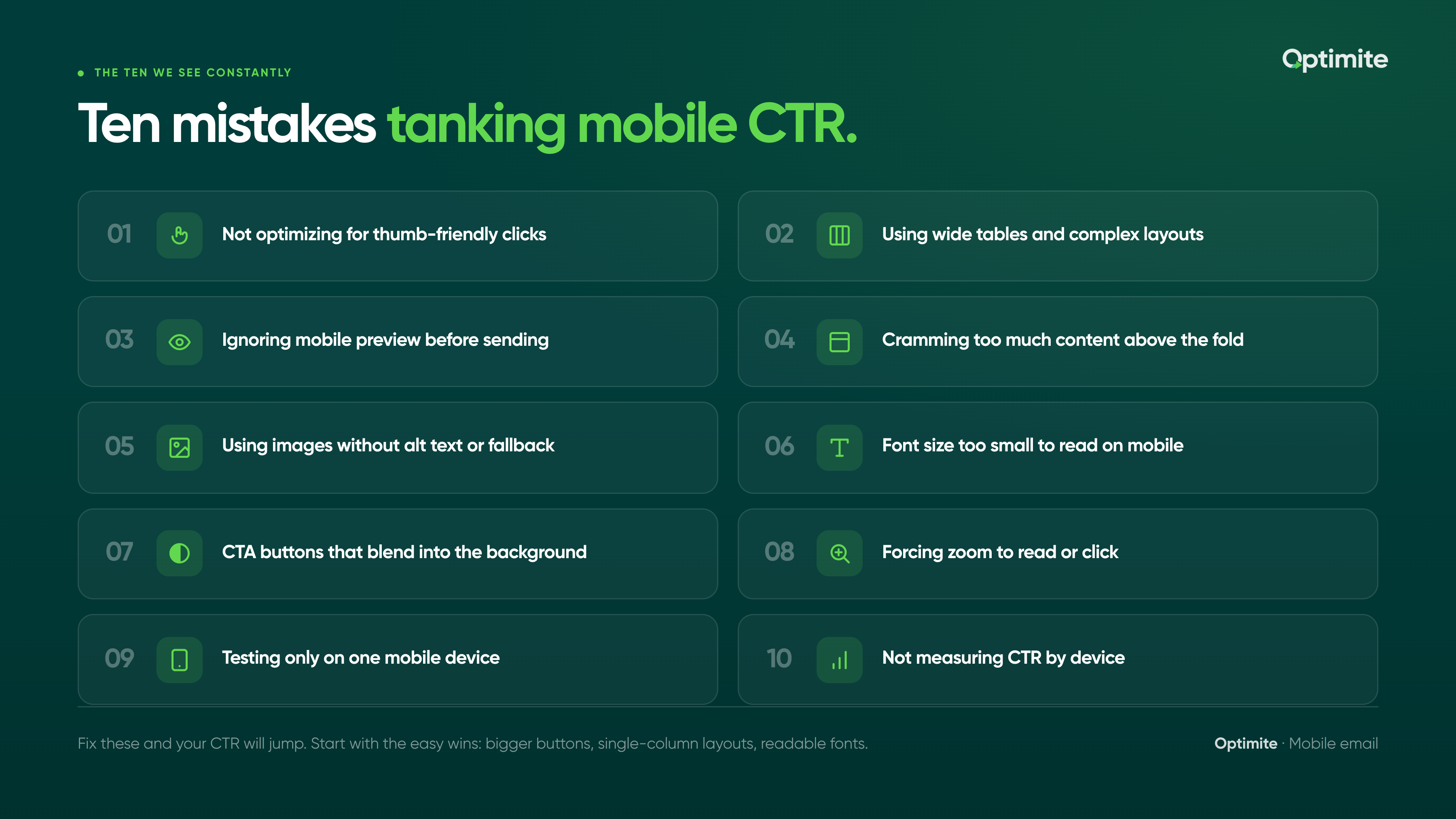
Not optimizing for thumb-friendly clicks
This is the biggest one. On desktop, you can click a small link. On mobile, you need to tap with your thumb. A 12-pixel-wide link is clickable on desktop. It's impossible on mobile.
Your CTAs need to be thumb-sized. That means buttons need to be at least 44 pixels tall and 44 pixels wide. Minimum. Bigger is better.
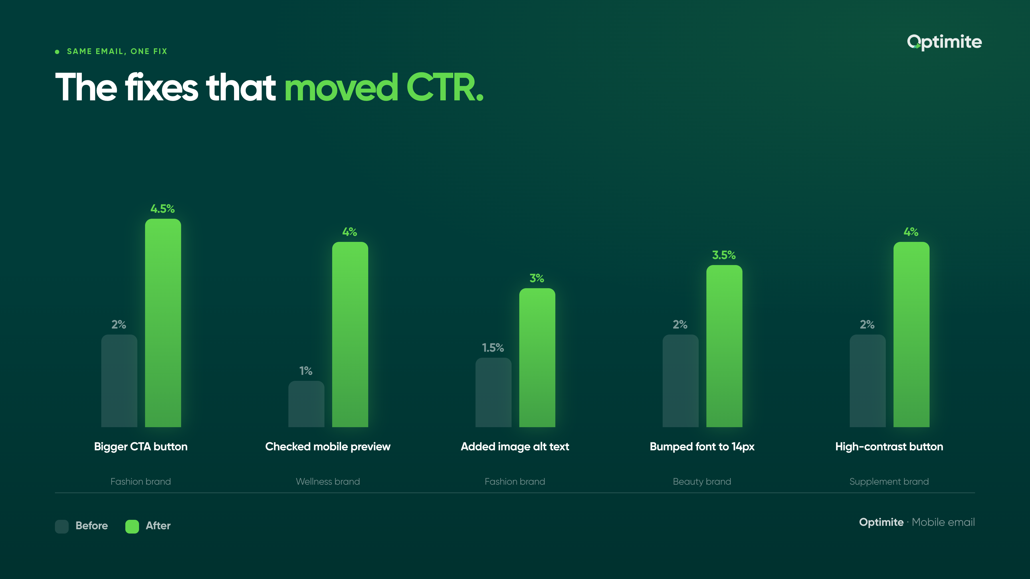
A fashion brand we know was getting 2% CTR. Their CTA buttons were 30 pixels tall. Customers were missing the button. They resized to 48x48 pixels. CTR jumped to 4.5%. Same email, same offer, different button size.
The fix is simple: make your CTA button at least 44x44 pixels. Add padding around it so there's space between it and other clickable elements. On mobile, crowded buttons don't work.
Using wide tables and complex layouts
Desktop designers love tables. Multi-column layouts. Side-by-side elements. They look great on desktop.
On mobile, tables break. A three-column layout collapses into a mess. Columns stack on top of each other in unpredictable ways. Text overlaps. Images misalign. Your beautiful email looks like broken HTML.
Mobile email clients have limited width (usually 480-600 pixels). Wide tables cause horizontal scrolling. Customers don't scroll horizontally. They abandon.
The fix: use single-column layouts on mobile. Stack everything vertically. If you need multi-column on desktop, use mobile-specific CSS so it collapses properly on phones.
Mobile email is single-column by default. Design for that constraint first, then add desktop enhancements.
Ignoring mobile preview before sending
You design the email in your email platform. You preview it on desktop. It looks great. You hit send.
Then your customers open it on phones and it looks terrible. You never previewed on mobile.
Most email platforms have a mobile preview option. Use it. Actually click it. Look at how your email renders at 480 pixels wide. If it looks broken, fix it before sending.
A wellness brand we work with was sending emails without checking mobile preview. One email had a button that was barely visible on phones. 1% CTR. They checked mobile preview, fixed the button, and resent to their segment. 4% CTR on the resend.
Cramming too much content above the fold
The mobile fold is small. About 200-300 pixels before the customer has to scroll. If you cram too much content above the fold, the customer sees clutter. They don't know where to click. They scroll past.
Your most important CTA should be visible without scrolling. Everything else can be below the fold.
A food brand was putting a hero image, three paragraphs of text, and two CTAs above the fold. Mobile customers saw a wall of content. They didn't click anything. They deleted the email. The brand moved the secondary CTA below the fold and put the primary CTA front and center above the fold. CTR increased 30%.
Using images without alt text or fallback
Some mobile email clients don't load images by default. If your email is 80% images and 20% text, your customer opens the email and sees mostly blank space.
Add alt text to every image. If the image doesn't load, the alt text shows instead. Add text fallback below images. Important information shouldn't live only in images.
A fashion brand was sending image-heavy emails (hero images, product shots, no text). Half their subscribers had images disabled by default. Those customers saw blank space and no CTA. CTR was 1.5%. They added text descriptions below each image and alt text to every image. CTR jumped to 3%.
Font size too small to read on mobile
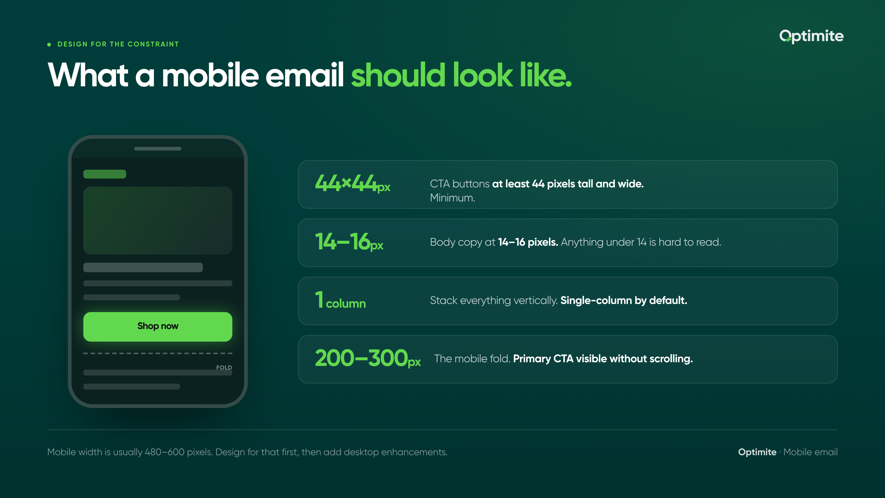
Anything under 14 pixels is hard to read on mobile. Customers don't zoom. They abandon.
Your body copy should be 14-16 pixels. Your headlines should be larger. Your CTAs should be legible without squinting.
A beauty brand was using 12-pixel font for body copy. On desktop it looked fine. On mobile it was tiny. Customers couldn't read the email. CTR was 2%. They bumped font size to 14 pixels. CTR went to 3.5%. Same content, bigger font.
Mobile fonts need to be readable at phone distance. Default is 14-16px. Don't go smaller.
CTA buttons that blend into the background
Your button needs to stand out. High contrast. Clear color. Obvious affordance that it's clickable.
A lot of brands use subtle buttons that blend into the background. Light gray button on light background. No border. No contrast. The customer doesn't see it as a clickable element.
A supplement brand was using a white button on a light gray background. Customers couldn't tell it was a button. CTR was 2%. They changed to a bold navy button. Contrast was obvious. CTR went to 4%.
Not stacking elements vertically
Mobile is narrow. Side-by-side columns don't work well.
If you have product recommendations in a 2-column layout on desktop, it probably stacks into a single column on mobile. But if the CSS isn't right, it might stack unevenly. Text might wrap weird. Images might get cut off.
Test your layouts on actual mobile devices. If something looks off, redesign for mobile first.
Forcing zoom to read or click
Some emails are designed so wide that mobile customers have to pinch and zoom to read them. Or the CTA is positioned off-screen so they have to scroll horizontally.
Mobile customers won't do this. They abandon immediately.
Design emails that are readable and clickable at 100% zoom on mobile. No horizontal scrolling. No pinching required.
A fashion brand was sending emails designed for desktop without mobile optimization. Mobile customers had to zoom to read the copy and zoom to click the button. CTR was 1%. They redesigned for mobile (single column, 14px font, proper CTA). CTR went to 3.5%.
Mobile email should never require zoom. If it does, redesign.
Testing only on one mobile device
iPhone renders email one way. Android renders it differently. Gmail on mobile renders differently than the native Mail app.
If you test only on iPhone, you're missing issues that Android users see. Your CTR looks okay overall but it's actually terrible for half your audience.
Test on multiple devices. iPhone and Android minimum. Check in Gmail, native Mail, and Outlook.
Not measuring CTR by device
You're checking your overall CTR. 3%. But if you break it down by device, mobile CTR is probably 1.5% and desktop is 5%.
Most email platforms let you see performance by device. Check it. If mobile is significantly lower, you have a mobile design problem.
A wellness brand was seeing 3.5% overall CTR. Desktop was 6%, mobile was 2%. They were optimizing for desktop when the real problem was mobile. Once they redesigned for mobile and fixed the mistakes above, mobile CTR went to 4% and overall CTR went to 4.8%.
Mobile email optimization is underrated. Most brands ignore it. The ones who fix it see immediate CTR improvements.
Start with the easy wins: bigger buttons, single-column layouts, readable fonts. Test on actual mobile devices. Break down your performance by device to see where the real problem is.
Your customers are opening email on phones. Design for that reality.
If you want help auditing your mobile email performance or identifying which of these mistakes is tanking your CTR, let's talk. We audit email workflows across dozens of D2C brands and we know which mobile optimizations move the needle most. See how we've helped brands across wellness, fashion, and food and beverage improve mobile CTR and repeat purchase rate.


